Premium INDICATOR
TRY THIS INDICATOR 1st MONTH FOR FREE
First month is always free to try. You PAY NOTHING for your trial period and it’s a no obligation trial period. There is no minimum term, if you don’t like it – you can cancel your subscription any time you want.
Try FREE for 1st MONTH
after first month just £23 /month
Your subscription will be processed through Paypal
If you are already subscribed to this indicator and want to unsubscribe, Please click here
WATCH THE VIDEO TO KNOW MORE ABOUT
Multi Time Frame Zone Drawing - Premium Indicator
- 1st month FREE TRIAL
- Access to all future updates
- 24/7 update and technical support
- Cancel subscription anytime
Indicator Details:
Multi Time Frame Zone Drawing indicator is custom programmed by Rize Capital to use with NinjaTrader 8 trading platform. This indicator is developed for all sorts of trading styles which involves drawing zones eg, Supply/ Demand, Support/ Resistance or any other types whilst getting various other useful information on the top-right side of the chart about the overall market price movement, in relation to the drawn zones, being on any time frame. Lets check the indicator details below.
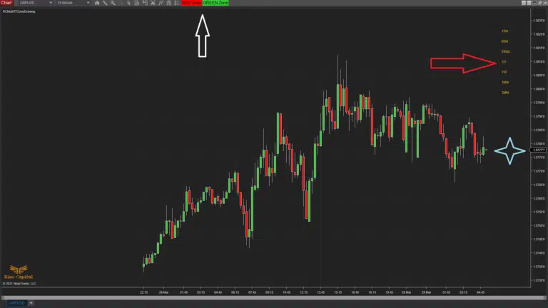
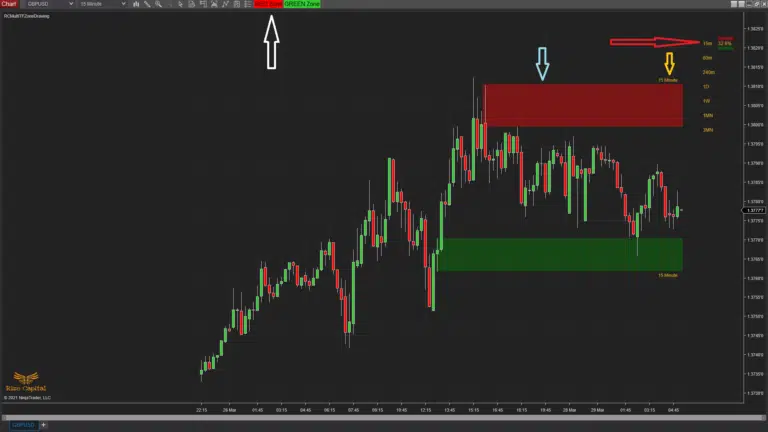
When you add the indicator to a chart, it will look like the Image – 1. Now in Image – 1, you can see two buttons on the chart tool bar which is pointed by white up arrow, a column of different time periods which is pointed by right red arrow (you may not see it, if you don’t have data feed connected to your platform, but when it connects it will show) and gap between current bar and right margin which is pointed with a light blue star beside right margin. The buttons on the toolbar are used for drawing the zones. Space marked by light blue star is to show a right margin space will remain empty between current bar and right margin so that chart bars do not overlap with any other information when you add this indicator to your chart. Column of various time periods at top-right corner on the chart, is consist of different specific time frames to show where the market price is between nearest two zones (ie, nearest Red and Green zones) drawn by you using this indicator and it is displayed in ‘%’ values. It will also plot the current nearest zones’ status with various color changes or removal of the zone with a small rectangle. We will see all those details and how to use or draw the zones below now.
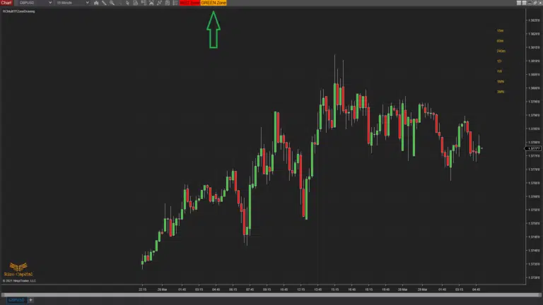
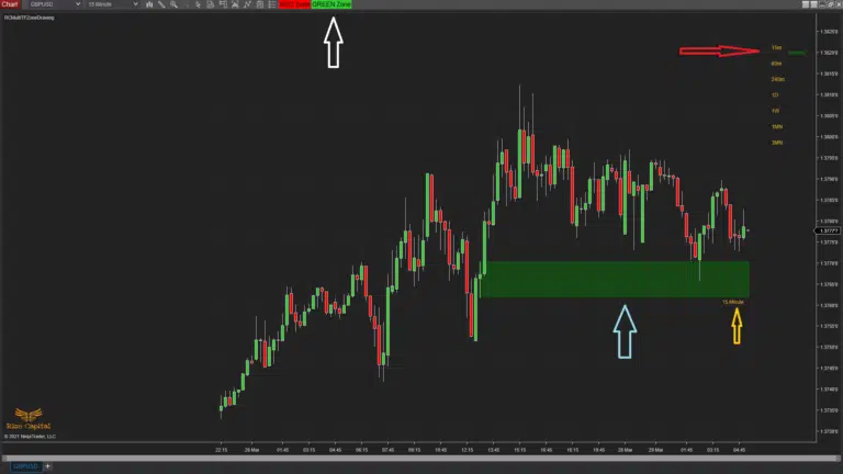
If you want to draw a GREEN zone, you will need to click on the ‘GREEN Zone’ button on the chart toolbar, pointed by green up arrow in Image – 2, which will change the color into orange after first click. And change of color means, its ready to draw. After clicking it, you can draw GEEN zone anywhere on the chart below the current market price, as shown in Image – 3 and pointed by light blue up arrow; If you try to draw a GREEN zone above current market price, it will change its color immediately and may not work properly. Every zone plotted will also have the chart time frame as label with it on the right, to show where the zone is originally drawn; In Image – 3, this time frame label is pointed by yellow up arrow. As soon as you finish drawing a zone, it will also draw a small rectangle with same color beside the same time frame at the top -right corner time periods column, in Image – 3, it is pointed by right red arrow. If for any reason color of the zone is changed or the zone is removed, the small rectangle will also reflect the same.
Now, after clicking the ‘GREEN zone’ button, you need to left click on your computer mouse once and release the left mouse. Then draw the zone by moving your pc mouse cursor and left click once more to stop drawing the zone. After initially clicking the ‘GREEN zone’ button, if you decided not to go ahead, then you can simply click the button once more and that will reset the button to its original color.
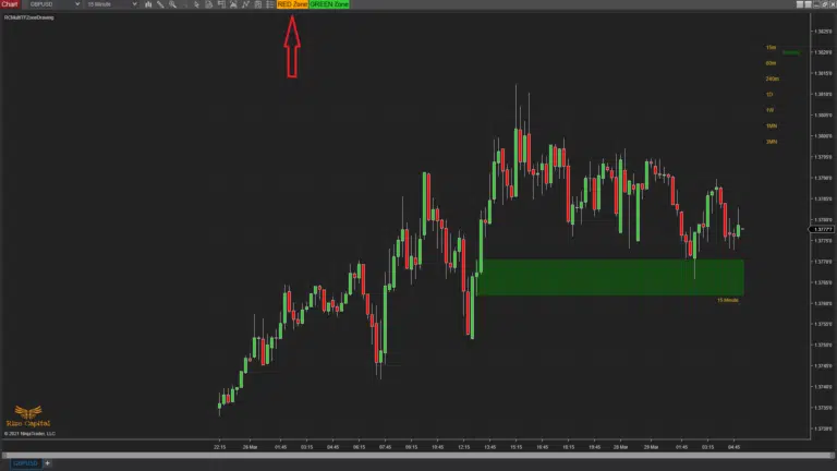
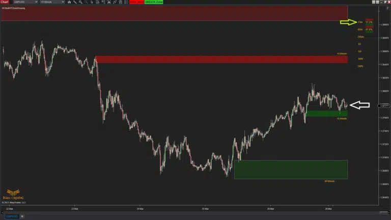
Now to draw a RED zone, you have to follow almost similar steps, but this time you will click on ‘RED zone’ button, which is shown in Image – 4 with red up arrow. After you draw the RED zone, pointed by light blue down arrow in Image – 5, it will also plot it’s time frame label (Image – 5, yellow down arrow) and at the same time, it will plot the red zone rectangle on the top – right corner time periods’ column which is pointed by red right arrow. But this time you will see the ‘%’ value there. Because, now you have drawn both GREEN and RED zones on either side of the market price and the number figure is representing where the current market price is between those nearest zones (Image – 9, current market price is pointed with white left arrow and ‘%’ value is pointed with yellow right arrow). Now if you move any of those zones for any reason, the ‘%’ value will change accordingly and if you manually remove or automatically the zone is removed, it will also remove the ‘%’ figure to reflect the change. But if there is any same colored zone exists even after removing any, it will adjust ‘%’ value with the nearest two opposite colored zones.
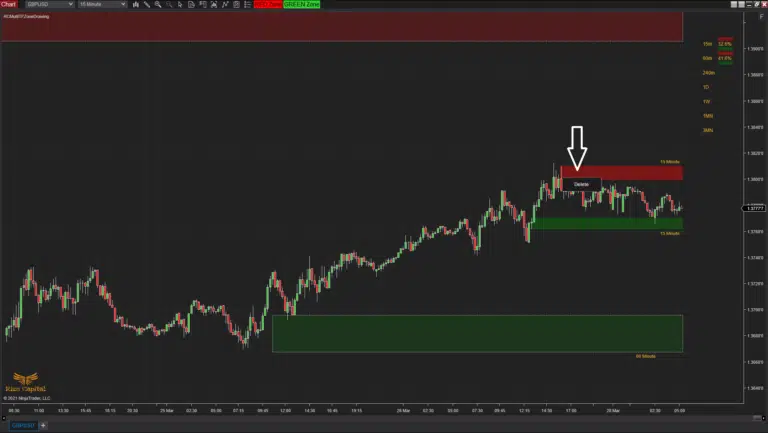
If you want to delete any zone, you can simply right click on top of the specific zone’s area and it will give you ‘Delete’ menu (Image – 6, pointed by white down arrow). You can left click on that to delete the zone manually.
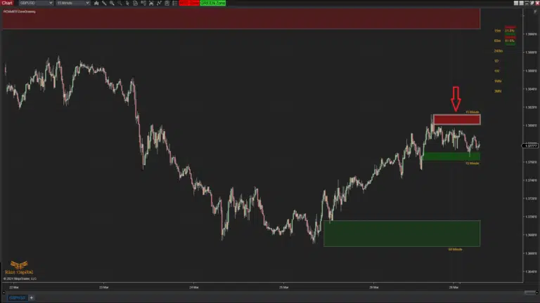
If you simply just want to move the zone location, you can left click on area of the zone once, then move it to your desired location (Please remember to keep the GREEN zones below the market price and RED zones above the market price) and left click once more to release the zone to its final position. When you left click first to move the zone, it will highlight it’s area with a border as shown in Image – 7 with red down arrow.
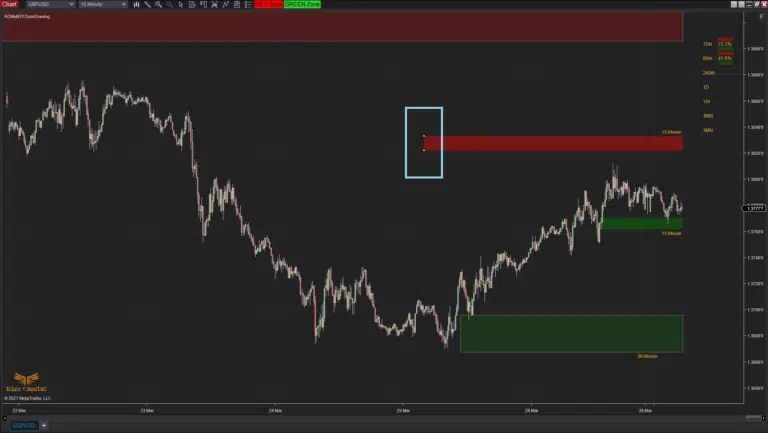
Now if you want to resize the height or width of the zone, you can simply left click on the left-top or left-bottom corner of the zone once and it will show two points as shown in Image – 8 within light blue rectangle. Then you can move the mouse cursor and change the size of the zone as you desire. When you are happy with the size, you can left click once more to release the zone. Please remember, all zones continues to plot on the right margin unless any changes made.
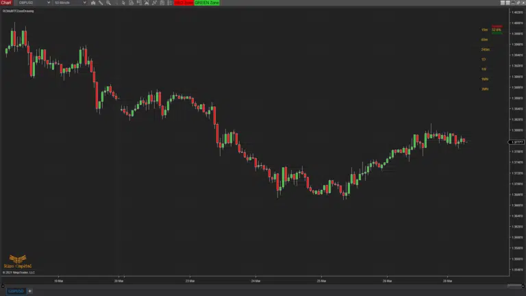
It’s important to remember, any zone drawn on lower time frame will not show when you are on higher time frame charts (Image – 10, zones drawn on lower time frame chart is not visible on higher time frame chart), but you can still get the zone related information on the top-right column where ‘%’ values are plotted (Image – 10).
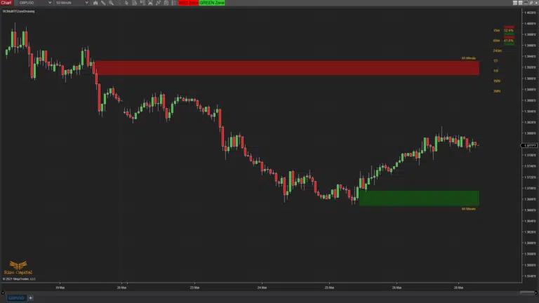
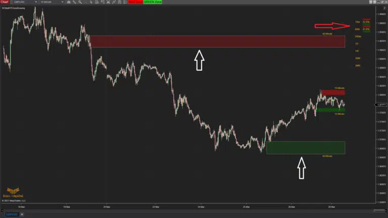
Now if you draw GREEN and RED zones on this higher time frame, it will show on the same higher time frame chart whilst you are there (Image – 11), as your drawn zones’ time frame and chart time frame are same. Though the zones drawn on lower time frame charts are not visible on higher time frame charts, but zones drawn on higher time frame charts are visible on lower time frame charts. In Image – 12, you can see higher time frame zones are visible which are pointed by white up arrows and respective time frame labels are also visible with the zones to identify them properly.
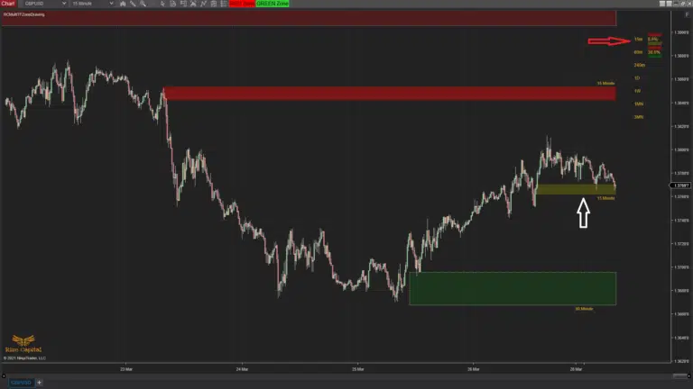
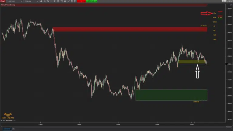
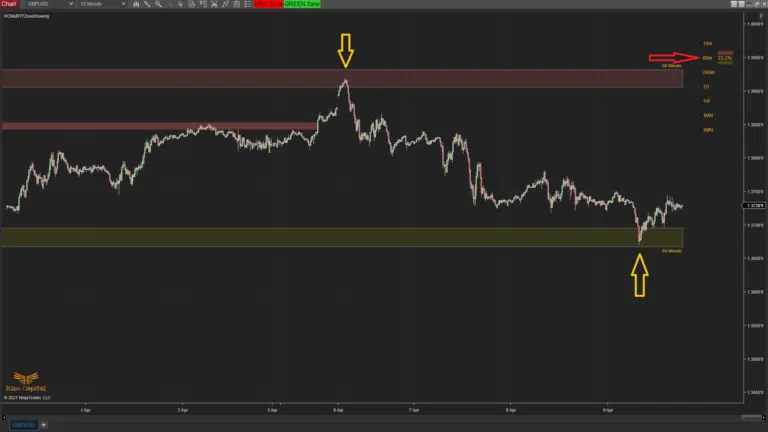
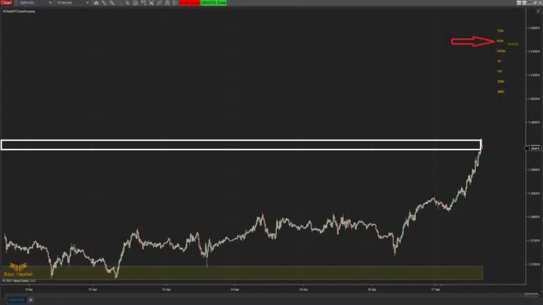
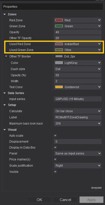
If you have GREEN or RED Zone drawn on the chart and price touches any of the zones, it will change the zone’s color to used zone colors (Image – 23, yellow rectangle) like it shows in Image 13 & 15, pointed by white arrows. When the color of the zone changes, you will also see similar change occurs in the color of the rectangle at the top-right corner (Image – 13 & 15, pointed by right red arrows). But the zones will continue to plot until the price passes through the outer edge of the zone. When it does happen, respective zone will stop plotting (Image – 14 & 16, pointed by white arrows) and at the same time, respective rectangle from the top-right corner column will be removed as well (Image – 14 & 16, pointed by red right arrow).
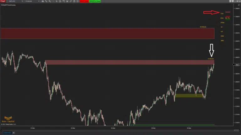
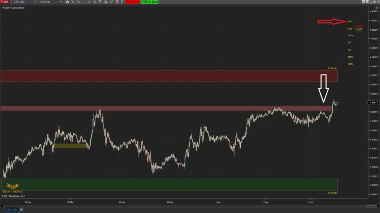
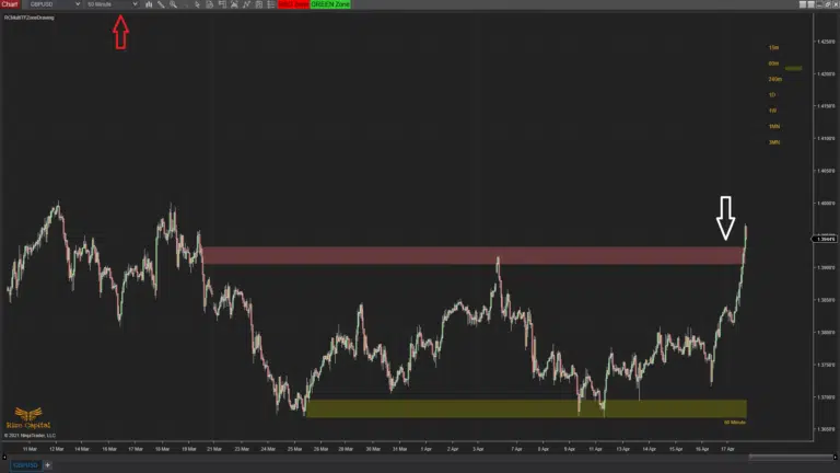
Now similar changes happens, if you are on lower time frame chart and if price touches the zones drawn on higher time frame (Image – 17, pointed by yellow arrows) and top-right corner ‘%’ column rectangle colors also reflect that (Image – 17, red right arrow). But if you are on a lower time frame chart and market price passes through a higher time frame zone’s outer edge, it will be removed from the lower time frame zone (Image – 18, zone is removed which are previously drawn around white rectangle area) and top-right corner column’s rectangle for the higher time frame is also removed at the same time (Image – 18, red right arrow). However, if you go to that specific higher time chart, you will still be able to see the zone (Image – 19, pointed by white down arrow) though it has stopped to plot further to the right.
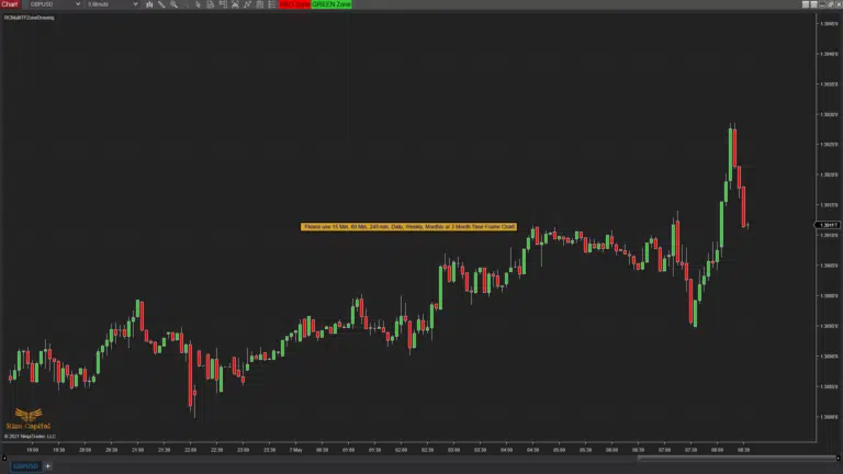
Please note, currently this indicator can be used on any instrument, but only works with 15 min, 60 min, 240 min, Daily, Weekly, Monthly and 3 Monthly time frames. If you try to use it with any other time frame charts, it will show you a reminder text like Image – 20 so that you can adjust the chart time frame accordingly. Also, any zone drawn are stored if you close the chart or platform and restored after you restart your NinjaTrader 8 platform as it was.
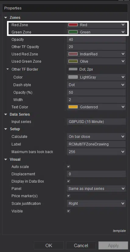
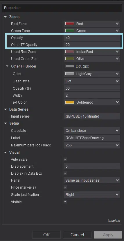
You can customize the colors of the zones from the options highlighted within white rectangle in Image – 21. You can also amend the opacity of zones plotted both on current time frame chart and other time frame charts from the settings options highlighted by light blue rectangle in Image – 22. As mentioned previously above, you can customize both Used red and green zones’ colors from the options highlighted by yellow rectangle in Image – 23.
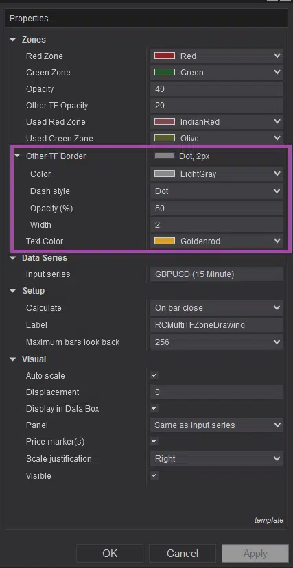
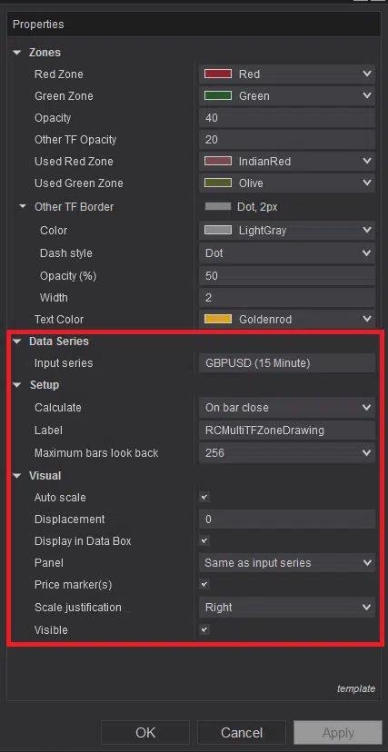
Zones drawn on current time frame chart and other time frame charts are separated visually by a border around zones drawn on other time frame charts. Depending on your platform skin or chart color, you can customize the color of this border from the ‘Other TF Border’ options which is highlighted with purple rectangle in Image – 24. It is highly recommended not to make any change to the default settings which are highlighted with red rectangle in Image – 25 for accurate functioning of this indicator.
Upgrade Notes:
Version: 5.2.0.1
- This can be used on any instrument
- Can be used on 15 Min, 60 Min, 240 Min, Daily, Weekly, Monthly and 3 Monthly time frame charts
- Script optimized
- All colors and fonts are customizable
- Auto update and announcement added
